 AJ 14, Salt Lake, Sector 2, Kolkata - 700091 |
  743 Virginia Ave NE Atlanta, GA 30306
3 Ways Your Site Might Fail Google’s Mobile-Friendly Test
Google announced a new search results label stating if a site is “mobile-friendly” or not. Now, when you’re on your phone, you’ll know in advance whether the site you’re planning to visit is optimized for your device.
Accompanying the announcement, Google said they are also experimenting with a ranking boost for sites passing their “mobile-friendly check.” First, you should know that the object of a robots.txt file is to tell search engine crawlers, such as Google, what pages or files it should or should not look at on your website.
A common use of robots.txt is to avoid the appearance of login or thank you site in the search results. Robots.txt is often also used on websites operated by a content management system to block other administrative directories on your website that are used to run your content management system.
Second, a responsive or mobile page usually relies on CSS stylesheets and javascript files to view a changed template on smaller screens. Normally these files are stored in your web server’s external folders and then accessed by individual web pages.
So what do you think will happen if a robots.txt file prevents Google from accessing these CSS stylesheets and javascript files? Google thinks that your website is not mobile-friendly–it looks perfectly fine on your smartphone in fact!
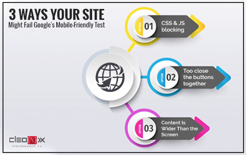
Here are the 5 most popular things that make Google’s Mobile-Friendly Review a supposedly mobile-optimized page fail.
1. CSS and JS blocking:
Google has already stated specifically that blocking Image, CSS, and JavaScript resources from their bots are contrary to their webmaster guidelines and can adversely affect your indexing and ranking. But worse, these are the elements search engines need to make your mobile site find. This is a simple solution: don’t do it. Stay rid of these orders from the meta robots. Check your files with robots.txt; especially if your resources are delivered through a CDN.
You may like: 6 most essential elements you must know to make a good web design
2. To close the buttons together:
Another thing Google is looking at is the closeness of your links. Fingers are much clumsier than mouse pointers (especially if you’re me) and as a result, Google uses link size and proximity as a mobile-friendly factor.
Make sure that important buttons have a height and width of at least 7 mm (or 48 CSS pixels) to ensure that your site passes the tap test. You can make less important links smaller, but you must be sure that within 5 mm (32 CSS pixels) of them there are no other links.
3. Content Is Wider Than the Screen:
Making sure you don’t have to scroll sideways to see your page might sound like a no-brainer, but it was one of the most common flags the Mobile Tester threw out.
Typically, the correct use of the viewport meta tag is your best width management solution. This enables you to instruct browsers to show the dimensions of a page based on the size of the screen.
So, at last, we could conclude that if your website works well on your smartphone, you can definitely run it through a mobile-friendly review tool to ensure that you are not penalized unknowingly in mobile search.
