UI vs UX: Design is a rather broad and vague term. With the relatively recent influx of tech companies focused on creating interfaces for screens, many new design roles have emerged. Now a days one of the hottest topics on the internet is UI vs UX.
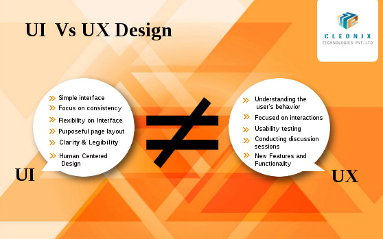
“UI” stands for “User interface”. The main focus of UI design is to offer the users with a complete system which helps them with the accomplishment of tasks in the best possible manner.
- Simple interface
- Focus on consistency
- Flexibility on Interface
- Purposeful page layout
- Clarity & Legibility
- Visual Design
“UI” stands for “User interface”. The main focus of UI design is to offer the users with a complete system which helps them with the accomplishment of tasks in the best possible manner.
- Simple interface
- Focus on consistency
- Flexibility on Interface
- Purposeful page layout
- Clarity & Legibility
- Human Centered Design
“UX” stands for “User Experience Design”. UX is nothing but how a person feels when interfacing with a system. This system could be a website, a web application or desktop software and, in modern contexts, is generally denoted by some form of human-computer interaction (HCI).
- Understanding the user’s behavior
- Focused on interactions
- Usability testing
- Achieved through conducting discussion sessions
- Research on new Features and Functionality
Read more
There are numerous websites on the Internet, and hundreds or probably thousands are created by day.It happens to everyone at some point: You look back on a website design and realize that you made a mistake.Let’s narrow the focus to the most common 6 mistakes.Avoid these,learn to correct them and your site will be far better than much of the competition.
- Designing Without a Grid
- Less Whitespace
- Moving Forward with Poor Images
- Not Using a Color or Typography Palette
- Overcomplicated Navigation
- Site is Slow to Load
Designing Without a Grid:
While the concept is solid, the lack of a grid can leave a website hanging on a shaky skeleton.Designing with visible grids is trending and functional, and you can use a variety of design tools, such as UXPin or Adobe’s Creative Cloud to help you.
Less Whitespace:
Whitespace is an important element of design for good reason because too little whitespace leads to confusion, disorganization and unreliability.Properly using whitespace will give your client’s readers the best experience.
Moving Forward with Poor Images:
Every good website starts with a good image.Images should fit in with the purpose, organization, and style of the page. Avoid using high quality images with large file sizes.
Not Using a Color or Typography Palette:
The most important thing of a good website designing is it’s readability & grab the users’ attention.A website design project is just like any other when it comes to style and branding, and consistent color and typography palettes are vital.
Read more
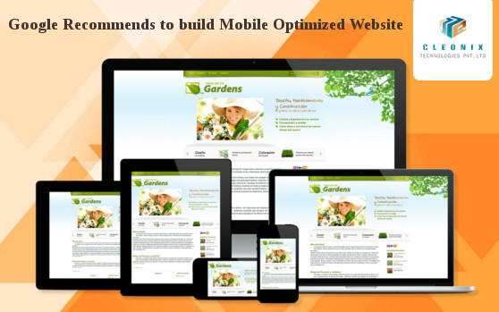
There are more than 1.5 billion mobile Internet users worldwide and roughly 80 percent of Internet users own a smartphone. So, though You may have a best developed desktop website , you can not keep your business ahead of this competition era until you too have Mobile Optimized Website.Google lately rolled out the mobile-friendly update or ‘Mobilegeddon’ .
On February 26, 2015 Google gave marketers incredible insight into changes they have planned for their search algorithms and the exact day they will go into effect. Specifically, they announced that on April 21, 2015 mobile search engine results pages (SERPs) will be impacted by the mobile-friendliness of a website.
Technology platforms that are mobile-friendly allow users to get a close look at the share of voice in their industry across various devices, such as smartphones and tablets, and compare to competitors.
With the recent Google algorithm update, Responsive Web Design( RWD )is its preferred design option.Here we can say about Responsive Web Design( RWD ) ,it is a setup where the server all the time sends the same HTML code to all devices and CSS is applied to alter the display of the page on the device.Wikipedia defines Responsive Web Design as “an approach to web design aimed at crafting sites to provide an optimal viewing experience—easy reading and navigation with a minimum of resizing, panning, and scrolling—across a wide range of devices (from desktop computer monitors to mobile phones).”
Source:searchenginewatch.com,Wikipedia
Read more
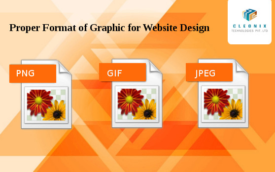
In a website design different formats (JPEG, GIF, and PNG ) of graphics are used. It’s important to know the difference between the different image formats and how to use them in each situation. Because using the proper formats, give the site a different edge.
About the .JPG Format
JPEG stands for Joint Photographic Experts Group. It is a standard method of compressing photographic images. We also call JPEG the file format which employs this compression. The JPEG images offer compressed file types and provide high quality appearance. We use Use JPG images for photographs and other images that have millions of colors. It uses a complex compression algorithm that allows us to create smaller graphics by losing some of the quality of the image.
About the .GIF Format
The GIF format is one of the oldest graphic formats used for designing sites having existed since 1989.GIF, short for Graphics Interchange Format, is limited to the 8 bit palette with only 256 colors. GIF is still a popular image format on the internet because image size is relatively small compared to other image compression types. The use of this file format ensures quick loading of the images used on the site. For animating the still images, mostly the GIF file types are used as plug-ins are not required for it. It also supports transparency.
About the .PNG Format
PNG short for Portable Network Graphics is a recently introduced format, so not everyone familiar with it. Though it has been approved as a standard since 1996.This image format specifically designed for the web. PNG often creates smaller file sizes than GIF
.It supports lossless data compression. PNG was created as an improved, non-patented replacement for Graphics Interchange Format (GIF), and is the most used lossless image compression format for web designing.
Read more
 AJ 14, Salt Lake, Sector 2, Kolkata - 700091 |
  743 Virginia Ave NE Atlanta, GA 30306