In today’s digital age, having a website is essential for businesses and individuals alike. However, it’s not enough to simply have a website; you must also focus on creating a positive user experience (UX) for your visitors. A great user experience can significantly impact your website’s success, from attracting and retaining users to boosting conversions and customer satisfaction. In this blog post, we will discuss some valuable tips to help you improve your website user experience.
- Responsive Design: One of the fundamental aspects of a good user experience is ensuring that your website is responsive. With the ever-increasing use of mobile devices, it’s crucial that your site adapts seamlessly to different screen sizes. A responsive design ensures that users can access and navigate your website easily, regardless of the device they are using.
- Clear and Intuitive Navigation: Navigating a website should be effortless for visitors. Implementing a clear and intuitive navigation structure will help users find the information they’re looking for quickly and efficiently. Consider using a logical hierarchy of menus, including drop-downs or breadcrumbs, to provide users with a sense of orientation and allow them to navigate your site with ease.
- Streamline Content and Structure: Presenting your content in a structured and organized manner is vital for a positive user experience. Break your content into sections and use headings, subheadings, and bullet points to make it scannable. Be concise and eliminate unnecessary fluff. Users should be able to skim through your content and grasp the main points without any confusion.
- Optimize Page Loading Speed: In today’s fast-paced world, users have little patience for slow-loading websites. A website that takes too long to load can lead to frustration and increased bounce rates. Optimize your website’s performance by compressing images, minifying CSS and JavaScript files, and leveraging browser caching. Regularly monitor your site’s loading speed and make necessary adjustments to ensure optimal performance.
- Use Visuals Wisely: Visual elements such as images, videos, and infographics can enhance the user experience if used judiciously. High-quality images and videos can grab attention, convey information effectively, and create an emotional connection with your audience. However, be cautious not to overload your website with heavy media files, as this can negatively impact loading times.
- Incorporate Consistent Branding: Consistency in branding across your website is essential for a cohesive user experience. Use consistent colors, fonts, and imagery that align with your brand identity. This helps users recognize your brand easily and builds trust and familiarity. Ensure that your logo and branding elements are prominently displayed throughout the site, especially on the homepage.
- Implement Clear Call-to-Actions (CTAs): A clear call-to-action is crucial to guide users towards their desired actions on your website, whether it’s making a purchase, signing up for a newsletter, or contacting you. Use concise and action-oriented language for your CTAs, and make them visually distinct from other elements on the page. Experiment with different placements and designs to find the most effective CTA strategy for your audience.
- Optimize Forms and User Input: Forms play a significant role in gathering user data and enabling interactions on your website. Ensure that your forms are user-friendly and easy to fill out. Minimize the number of required fields and use smart form validation to provide real-time feedback to users. Implement autofill capabilities whenever possible to streamline the process further.
- Prioritize Accessibility: Designing your website with accessibility in mind ensures that all users, including those with disabilities, can access and navigate your content. Use descriptive alt tags for images, provide captions for videos, and ensure sufficient color contrast for text readability. Implementing accessibility features not only helps a wider audience engage with your website but also demonstrates your commitment to inclusivity.
- Test and Gather User Feedback: Continuous testing and gathering user feedback are essential for improving your website’s user experience. Conduct usability testing with real users to identify any usability issues or areas for improvement. Collect feedback through surveys, feedback forms, or user analytics tools. Use this valuable input to make data-driven decisions and refine your website to better meet the needs and expectations of your audience.
Conclusion:–
Providing a positive user experience is crucial for the success of your website. By following these tips, you can create a website that is intuitive, visually appealing, and optimized for performance. Remember to regularly monitor and analyze user behavior to identify areas for improvement and stay updated with evolving trends and technologies. By prioritizing user experience, you can enhance engagement, increase conversions, and establish a strong online presence for your brand or business.
ALSO READ: Why Custom 404 Page is More Important for a Better User Experience

We all know how important it is to have a website that has a super-fast loading speed. In today’s world, where everything has come within our finger’s reach by the means of technology and its use of the internet, websites are basically acting as the channels or portals to another realm, where sits the products, services or information that one seeks to find. It is that easy for the end-user to look-up something they need over the internet and access it that much easily. A process that is almost entirely hassle-free!
Except, when they click on a website, it starts to load, and within the extra few seconds that the site might have taken to load, the consumer will almost certainly change their minds about purchasing a product or purchasing it from the same website. Now, if you have a website, you certainly will not want this to happen. Hence, speed of a website is considered as one of the most crucial factors that any business or individual needs to pay attention to.
An optimum loading speed for a website is considered to be within 1 second. Between 1 to 3 seconds, it is considered as an average speed and any longer than that, and the website tends to lose on its visitors’ attention and hence, chances of conversions. That causes such a direct loss to the revenue generation for any business that conducts sales and business via the online medium (i.e. e-commerce websites). Obviously, this needs to be taken care of with a lot of website optimization work. So, what all can be done to make sure a website is running at its optimum speed? Let’s have a look:
• Using an optimized server hosting: Hosting style of the server plays a very crucial role in determining the speed of the website and hence should always be optimized as per the requirements of the site.
• Utilizing the browser’s cache: Whenever possible, when the browser cache is utilized to access resources, the website always loads faster as the browser isn’t required to find the resources from the original source, hence making it a faster process.
• GZIP compression: A golden rule is to use GZIP compression to reduce the file size by 70%. As the reduced file size is easier to transfer from the server to the browser, the website speed is increased significantly.
• Using a CDN: CDN (or a Content Delivery Network) works to deliver content more efficiently to the users as it is a collection of web servers present across multiple locations. For this, the servers with the quickest response time or lowest network hops are selected to deliver the content, from the closest location, hence speeding up the process.
Read Also:- What should not be included on your website?
• Identifying and removing unnecessary items: Often a website has a lot of installed software and modules that might not be even needed any more. Configuration of the MySQL to decrease the cache size frees up a lot of space. Also, Apache configuration can be done to disable modules that are not required.
• Reducing re-directs: Redirects from one URL to another lead to extra HTTP requests and hence slows down the website by causing increased latency. Hence, it is very necessary to limit the redirects.
• Image optimization: You should make sure the images on your website are optimized so that they are cropped down to the smallest size possible without affecting the quality, saved using the JPEG format and have valid src attributes added to them.
• Avoid query strings from static resources: As any link with “?” in the URL will not be cached, any static URL should avoid using query strings. They can be used for the dynamic sources on the website.
• Code optimization: The code should be properly optimized to remove any kind of extra spaces, blanks or HTML comments.
While these are some of the most common and useful tips to speed up a website, there can be a lot many approaches when it comes to optimizing the website to achieve its optimum speed. Hence, it’s a task best left for experts who can properly backup the existing website and then optimize it element by element to get you the desired results.
Read Also: SEO tips & tricks to better optimize Your Website

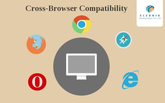
Now a days,Internet users have so many browser options,multiple screen sizes and access devices so the designers and developers have to make sure websites with cross browser compatibility features i.e; compatible with as many browsers as possible. Google Chrome, Internet Explorer and Mozilla Firefox are the standard and most used browsers, but there is enough of audience for the Safari and Opera also.
How to fix most common browser compatibility issues
- Using proper DOCTYPE
- Using css reset
- Validation for HTML, HTML5 and CSS code
- Proper text alignment & font display
- Checking java script and jquery functionality
- Making a responsive website
Basically,it is almost impossible to achieve 100% compatibility throughout all browsers.Though we can try to ensure the basic codes displaying issues.

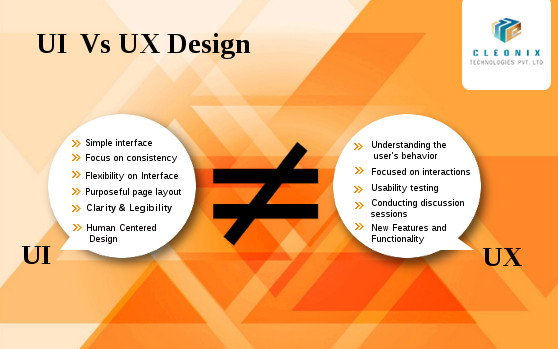
UI vs UX: Design is a rather broad and vague term. With the relatively recent influx of tech companies focused on creating interfaces for screens, many new design roles have emerged. Now a days one of the hottest topics on the internet is UI vs UX.
“UI” stands for “User interface”. The main focus of UI design is to offer the users with a complete system which helps them with the accomplishment of tasks in the best possible manner.
- Simple interface
- Focus on consistency
- Flexibility on Interface
- Purposeful page layout
- Clarity & Legibility
- Visual Design
“UI” stands for “User interface”. The main focus of UI design is to offer the users with a complete system which helps them with the accomplishment of tasks in the best possible manner.
- Simple interface
- Focus on consistency
- Flexibility on Interface
- Purposeful page layout
- Clarity & Legibility
- Human Centered Design
“UX” stands for “User Experience Design”. UX is nothing but how a person feels when interfacing with a system. This system could be a website, a web application or desktop software and, in modern contexts, is generally denoted by some form of human-computer interaction (HCI).
- Understanding the user’s behavior
- Focused on interactions
- Usability testing
- Achieved through conducting discussion sessions
- Research on new Features and Functionality

There are numerous websites on the Internet, and hundreds or probably thousands are created by day.It happens to everyone at some point: You look back on a website design and realize that you made a mistake.Let’s narrow the focus to the most common 6 mistakes.Avoid these,learn to correct them and your site will be far better than much of the competition.
- Designing Without a Grid
- Less Whitespace
- Moving Forward with Poor Images
- Not Using a Color or Typography Palette
- Overcomplicated Navigation
- Site is Slow to Load
Designing Without a Grid:
While the concept is solid, the lack of a grid can leave a website hanging on a shaky skeleton.Designing with visible grids is trending and functional, and you can use a variety of design tools, such as UXPin or Adobe’s Creative Cloud to help you.
Less Whitespace:
Whitespace is an important element of design for good reason because too little whitespace leads to confusion, disorganization and unreliability.Properly using whitespace will give your client’s readers the best experience.
Moving Forward with Poor Images:
Every good website starts with a good image.Images should fit in with the purpose, organization, and style of the page. Avoid using high quality images with large file sizes.
Not Using a Color or Typography Palette:
The most important thing of a good website designing is it’s readability & grab the users’ attention.A website design project is just like any other when it comes to style and branding, and consistent color and typography palettes are vital.

There are more than 1.5 billion mobile Internet users worldwide and roughly 80 percent of Internet users own a smartphone. So, though You may have a best developed desktop website , you can not keep your business ahead of this competition era until you too have Mobile Optimized Website.Google lately rolled out the mobile-friendly update or ‘Mobilegeddon’ .
On February 26, 2015 Google gave marketers incredible insight into changes they have planned for their search algorithms and the exact day they will go into effect. Specifically, they announced that on April 21, 2015 mobile search engine results pages (SERPs) will be impacted by the mobile-friendliness of a website.
Technology platforms that are mobile-friendly allow users to get a close look at the share of voice in their industry across various devices, such as smartphones and tablets, and compare to competitors.
With the recent Google algorithm update, Responsive Web Design( RWD )is its preferred design option.Here we can say about Responsive Web Design( RWD ) ,it is a setup where the server all the time sends the same HTML code to all devices and CSS is applied to alter the display of the page on the device.Wikipedia defines Responsive Web Design as “an approach to web design aimed at crafting sites to provide an optimal viewing experience—easy reading and navigation with a minimum of resizing, panning, and scrolling—across a wide range of devices (from desktop computer monitors to mobile phones).”
Source:searchenginewatch.com,Wikipedia

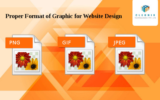
In a website design different formats (JPEG, GIF, and PNG ) of graphics are used. It’s important to know the difference between the different image formats and how to use them in each situation. Because using the proper formats, give the site a different edge.
About the .JPG Format
JPEG stands for Joint Photographic Experts Group. It is a standard method of compressing photographic images. We also call JPEG the file format which employs this compression. The JPEG images offer compressed file types and provide high quality appearance. We use Use JPG images for photographs and other images that have millions of colors. It uses a complex compression algorithm that allows us to create smaller graphics by losing some of the quality of the image.
About the .GIF Format
The GIF format is one of the oldest graphic formats used for designing sites having existed since 1989.GIF, short for Graphics Interchange Format, is limited to the 8 bit palette with only 256 colors. GIF is still a popular image format on the internet because image size is relatively small compared to other image compression types. The use of this file format ensures quick loading of the images used on the site. For animating the still images, mostly the GIF file types are used as plug-ins are not required for it. It also supports transparency.
About the .PNG Format
PNG short for Portable Network Graphics is a recently introduced format, so not everyone familiar with it. Though it has been approved as a standard since 1996.This image format specifically designed for the web. PNG often creates smaller file sizes than GIF
.It supports lossless data compression. PNG was created as an improved, non-patented replacement for Graphics Interchange Format (GIF), and is the most used lossless image compression format for web designing.
Cleonix Technologies
A professional Web Development Company is highly focused on providing world class and best in the industry standard services in every domain that we work upon.

 AJ 14, Salt Lake, Sector 2, Kolkata - 700091 |
  743 Virginia Ave NE Atlanta, GA 30306

