AJ 14, Salt Lake, Sector 2, Kolkata - 700091 |
  743 Virginia Ave NE Atlanta, GA 30306
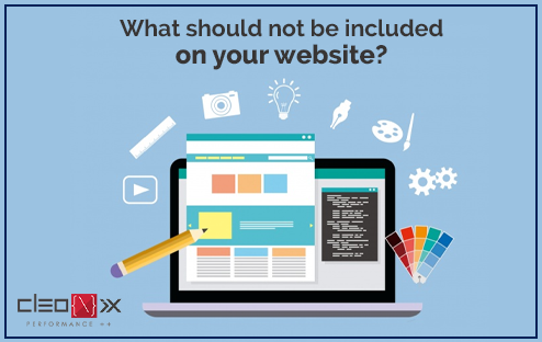
What should not be included on your website?
With all the inspiration on the internet around us, it can be difficult to figure out which pieces are most important to your website. Without understanding what should be on your website, you can easily end up with a useless one that does not reflect what your business is about or achieve your goals. We’ll discuss what should not be included in your website here.
1. White Space:
White space in terms of web design is “the space between graphics, columns, images, text, margins and other elements.” It is one of the most important design tools because it dictates how a page flows and reads. Notwithstanding its name, it is important to note that white space is not always white— it is just empty. The room on a website can easily be filled with a background color or basic texture, but it’s still white space if it doesn’t have any elements on it.
2. Automatic music / sound:
Have it sounded great on a website, but there are a good time and place for all? So just avoid the auto-play videos or music that will load when the website is launched. Instead, give the option to sound or not to visitors. This way, before they even know who you are, you wouldn’t lose your visitor.
If you really need to have sound on load, make sure you have a prominently displayed’ mute’ or’ turn off sound ‘ button.
3. Splash Pages:
As splash page is a welcome or entry page that loads for your website visitors before the actual home page. These so-called’ splash pages’ are more like splashy irritating roadblocks. Most of the time, these important tourists would have preferred to click on your website link from their rivals, so why do you need to ask them again if they really want to’ pass’ your website.
4. Complex Navigation:
The navigation of your website is much like a road map; it shows the list of all your sites to your users and where to find any information. Your navigation doesn’t have to be complex, it should be easy to use and locate. If you can, keep it lean and ensure that the information in it is properly organized to allow users to maneuver it seamlessly.
5. Pop-ups:
If you visit a website, you didn’t have these windows popping up with ads. Visitors to the website need to see that your website does not have pop-ups thrown at them. May be having an email address just before the user leaves the site or after spending a couple of minutes on the site.
6. Big Images:
Using photos of good quality, but make sure these images are optimized for easy download. It becomes frustrating for a visitor to wait for images to be downloaded, not even knowing what they are sometimes. Make sure that all your photos have’ alt’ and’ title’ tags to let your visitors understand what each picture is about. It will also allow you to achieve better ratings of search engines.
7. Inadequately written content:
Before writing something for your website, make sure that it is well written with proper grammar usage, clear punctuation, and correct spelling. Keep the writing style in a simple, clean and concise way to instill confidence in the company.
Consumers of today access your website from their desktops and laptops, as well as from their smartphones and tablets. This checklist will help ensure that your responsive site does what it should do for your business–to increase your profits. We, Cleonix Technologies, are a web development company specialized in all web development and digital marketing strategies in Kolkata. To produce an amazing outcome, we collaborate with companies of all shapes and sizes. If you think it’s time for your company to stand out from the crowd, we can help you get started!