 AJ 14, Salt Lake, Sector 2, Kolkata - 700091 |
  743 Virginia Ave NE Atlanta, GA 30306
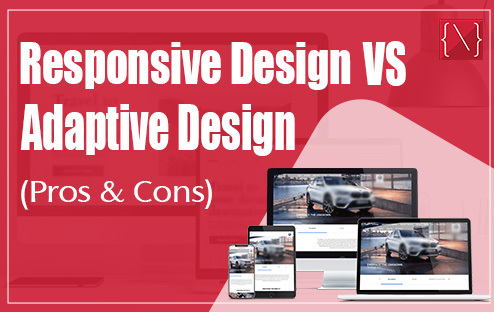
Pros and Cons Between Adaptive Design & Responsive Design
In today’s multi-device world, ensuring your website delivers a seamless experience across desktops, tablets, and smartphones is no longer a luxury, it’s a necessity. This is where responsive design and adaptive design come into play. Both approaches aim to create websites that adapt to different screen sizes, but they achieve this in fundamentally different ways. Choosing the right approach for your website depends on your specific needs, target audience, and budget. Let’s go deeper into the pros and cons of each method to help you make an informed decision.
Responsive Design: Fluid and Flexible
Responsive design is the current industry standard. It utilizes a single website layout that adjusts and reflows based on the user’s screen size. This is achieved through the use of CSS media queries, which are essentially sets of rules that dictate how the website elements should behave at different screen widths.
Pros of Responsive Design:–
- Reduced Development and Maintenance Costs: You only need to build and maintain one website, making it a more cost-effective solution.
- Flexibility: Responsive layouts can adapt to an infinite number of screen sizes, future-proofing your website for new devices and resolutions.
- Search Engine Optimization (SEO) Friendly: Search engines like Google favor mobile-friendly websites, and responsive design inherently delivers a good mobile experience.
- Consistent User Experience: Users will encounter the same branding and content across all devices, fostering a sense of familiarity and trust.
Cons of Responsive Design:–
- Potentially Less Control Over User Experience: Since the layout adapts automatically, you might have less granular control over how elements appear on specific devices.
- Complexity for Complex Layouts: Websites with intricate layouts or heavy use of multimedia might require more development effort to ensure a smooth responsive experience.
Adaptive Design: Tailored Experiences
Adaptive design, on the other hand, utilizes multiple pre-defined layouts optimized for specific device groups (e.g., desktops, tablets, mobiles). When a user accesses the website, their device is detected, and the most suitable layout is served.
Pros of Adaptive Design:–
- Highly Optimized User Experience: With dedicated layouts for different devices, you can create a highly tailored experience for each user group, potentially leading to better engagement.
- Faster Loading Times: Since users only receive the layout designed for their device, there’s less content to load, potentially improving website speed.
- Ideal for Complex Layouts: Websites with rich media or intricate layouts might benefit from the more structured approach of adaptive design.
Cons of Adaptive Design:–
- Increased Development and Maintenance Costs: Building and maintaining multiple layouts requires more time and resources.
- Limited Scalability: New device sizes or resolutions might require creating entirely new layouts to accommodate them.
- Potential for Inconsistent User Experience: The user experience can vary depending on the device used, which might be jarring for some users.
Choosing Between Responsive and Adaptive Design
So, which approach is right for you? Here are some factors to consider:
- Website Complexity: For simpler websites with straightforward layouts, responsive design is a great choice. For complex websites with rich media, adaptive design might offer advantages.
- Target Audience: If your target audience primarily uses desktops, responsive design might suffice. If your audience heavily relies on mobile devices, adaptive design might be worth considering.
- Budget: Responsive design is generally more cost-effective due to the need to maintain only one website.
- Future-Proofing: Responsive design is more adaptable to future screen sizes and devices.
Ultimately, the best approach depends on your specific needs and priorities. Consider your budget, target audience, and website complexity to make an informed decision.
Conclusion
Both responsive design and adaptive website design have their merits and drawbacks. By understanding the strengths and weaknesses of each approach, you can choose the method that best serves your website’s needs and delivers an optimal user experience across all devices. If you’re still unsure, consulting with a web design professional can help you make the best choice for your unique situation.
ALSO READ: Web 2.0 vs Web 3.0- Know The Differences & Similarities
